Client: Eato 何食今日
Project in 2025
Project in 2025
Scope:
Brand Identity
Brand Strategy
Packaging
Social Media
Print
Brand Identity
Brand Strategy
Packaging
Social Media
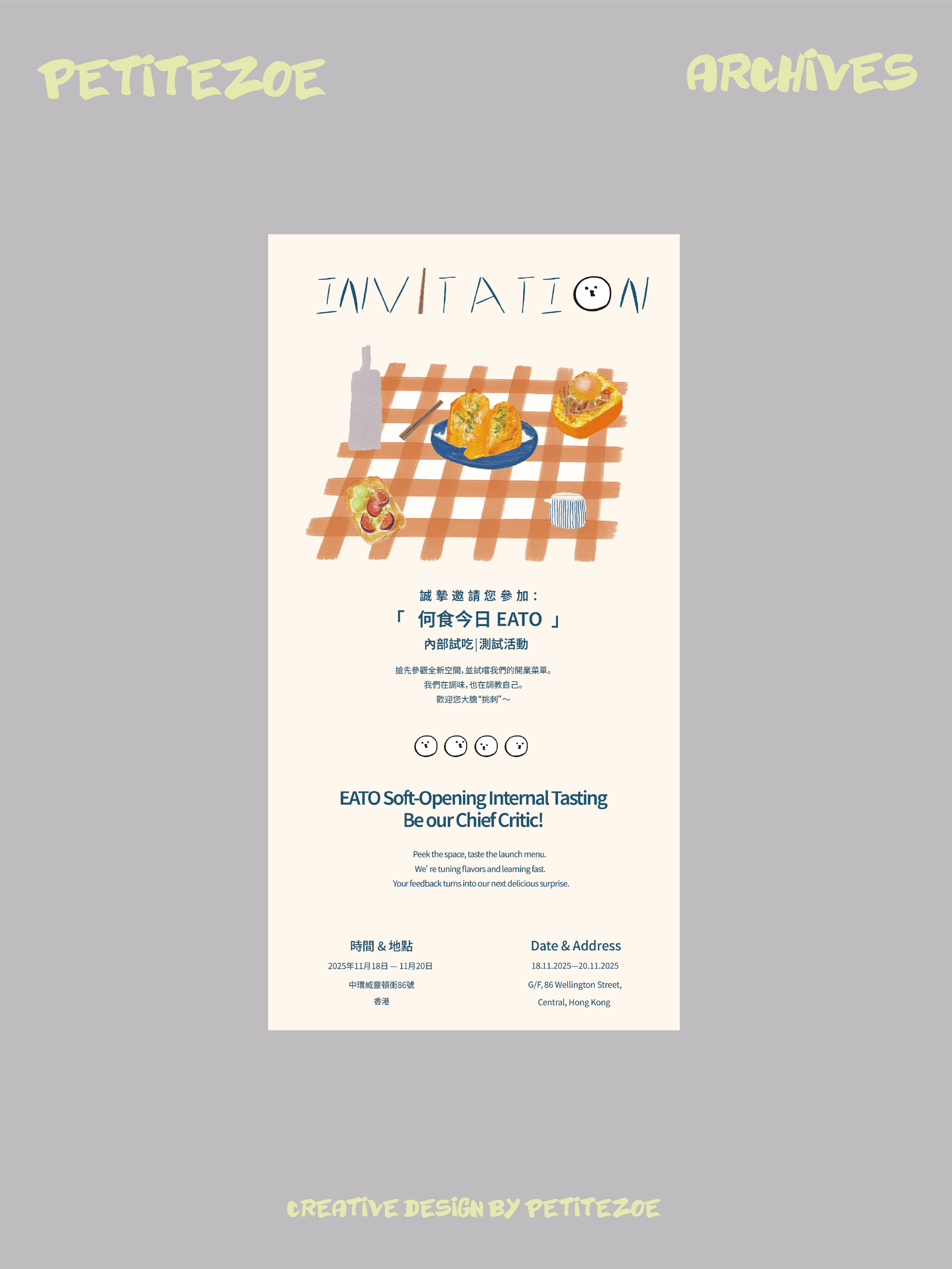
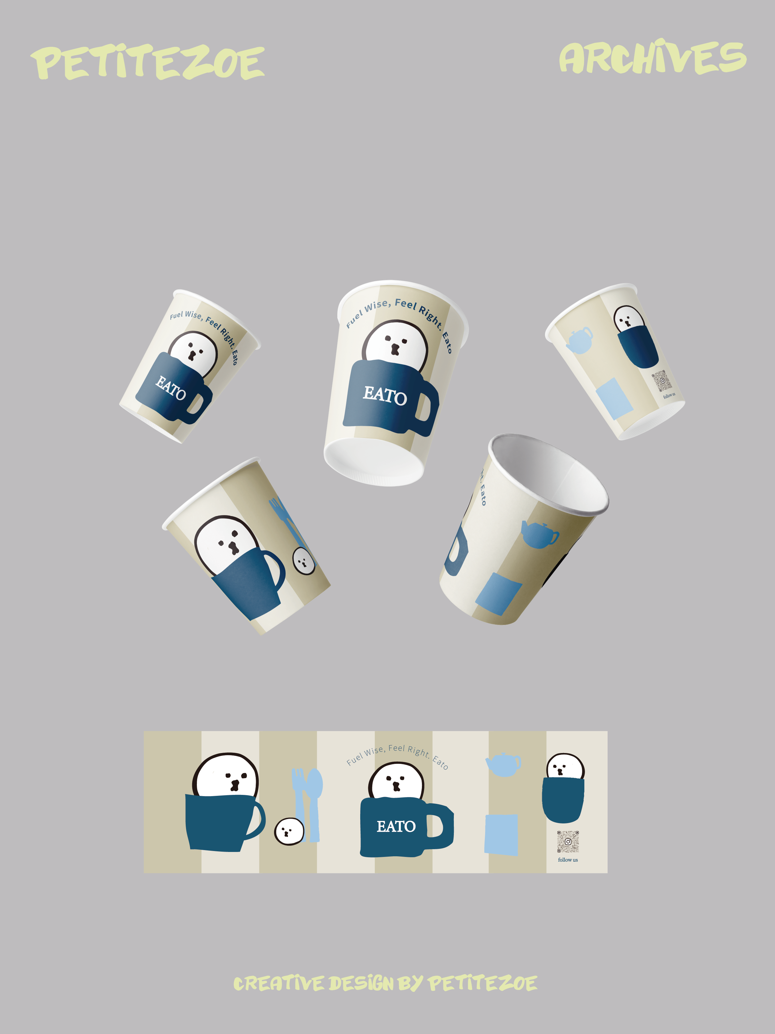
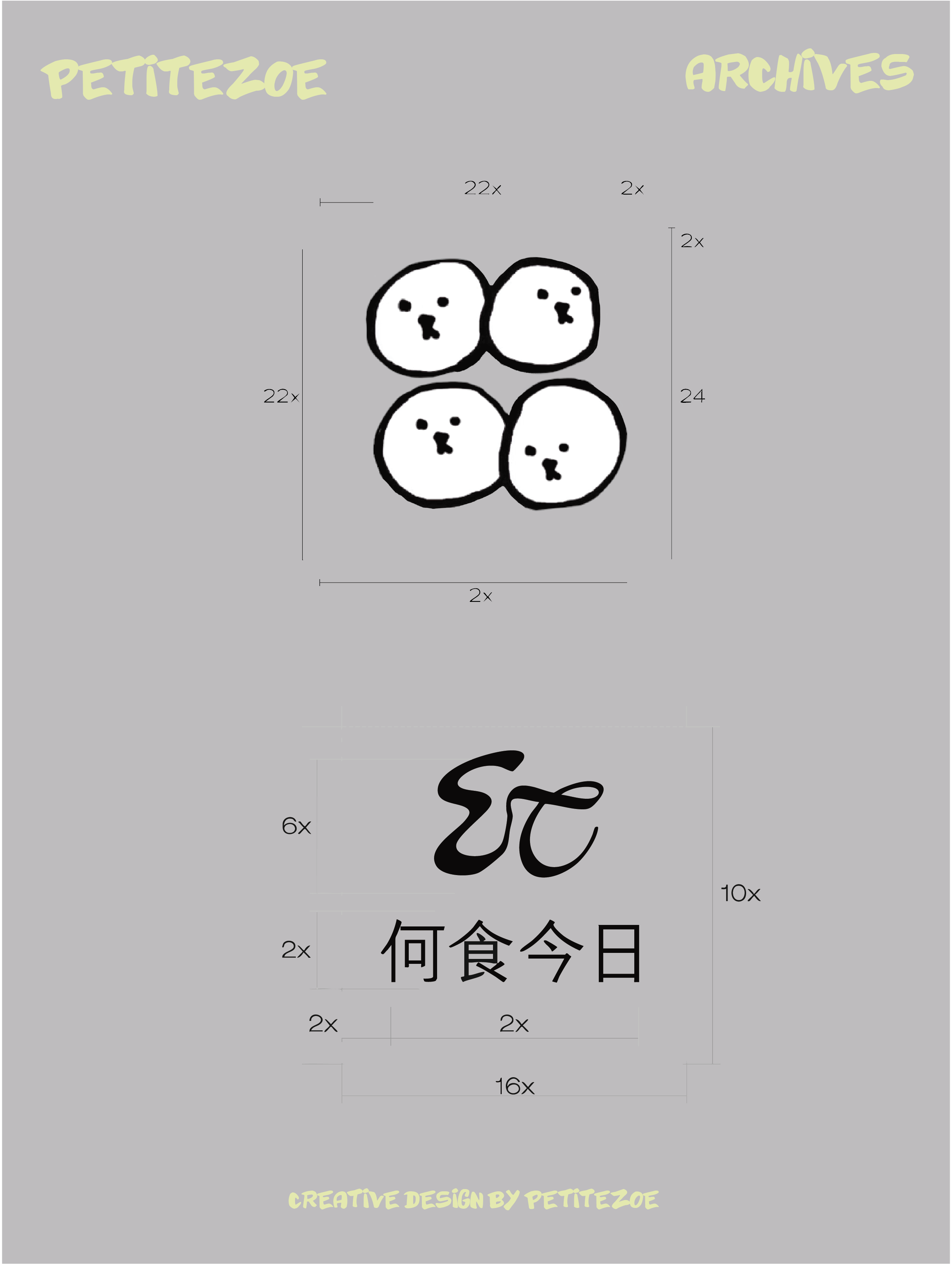
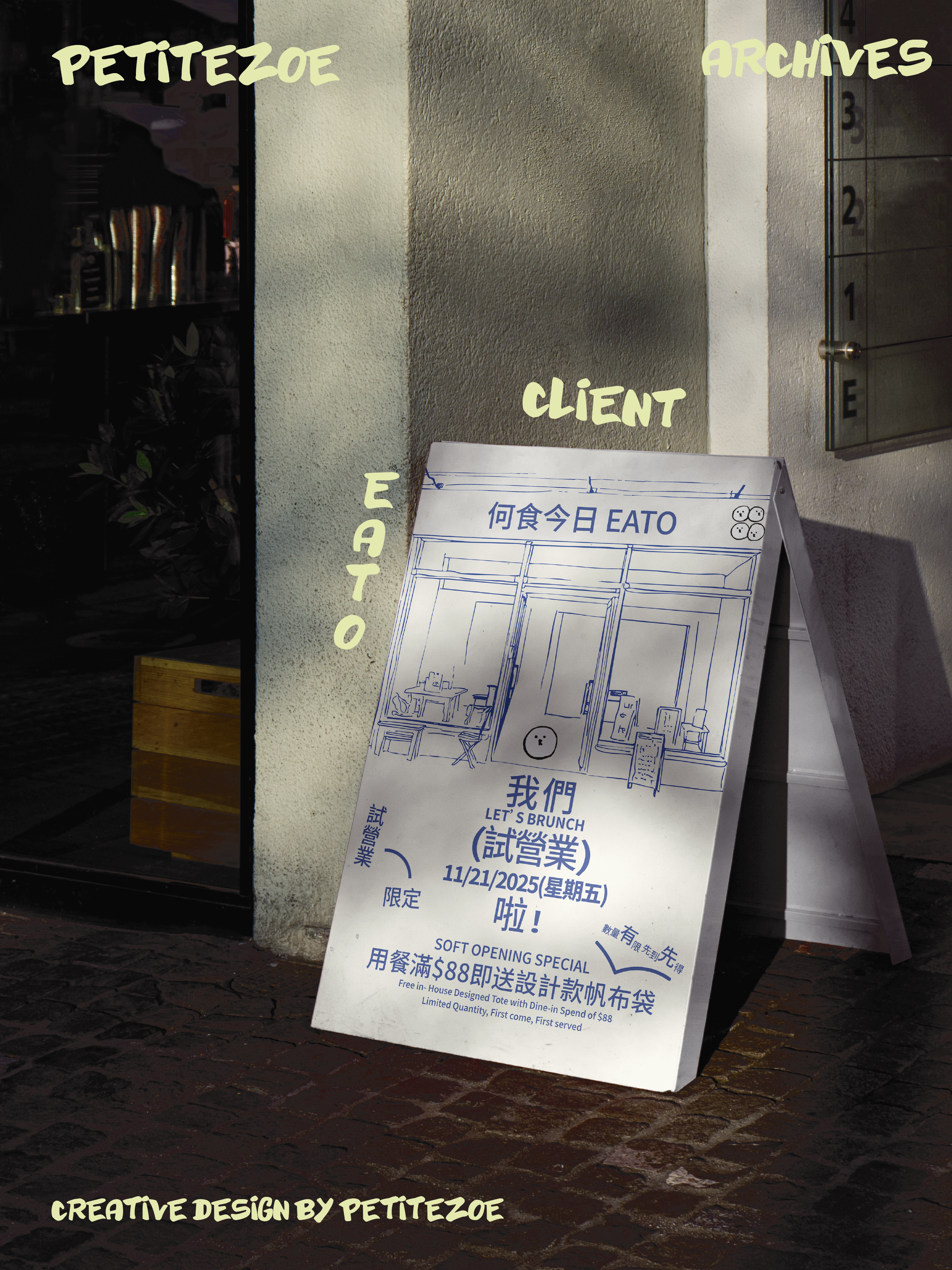
EATO is a contemporary tea-and-dining concept on Wellington Street in Central Hong Kong. Rooted in founder Fiona’s passion for fusion cuisine and Japanese drinking culture, the brand reflects her intuitive understanding of how people gather, unwind and reconnect in a fast-paced city like Hong Kong. As EATO prepared to launch its first location, I developed a visual identity that could articulate Fiona’s vision and support the brand’s long-term growth. Rather than approaching the project as a conventional F&B identity, I positioned EATO as a warm, modular, and culturally attuned dining brand, one that turns everyday meals into small, meaningful moments. Early in the project, one of the key challenges was building a scalable visual system while the menu was still evolving and without extensive food photography. To answer this, I looked directly at the foundation of Fiona’s cuisine: diverse flavours, playful combinations, and the cross-cultural softness that defines her dishes. The IP characters—four subtly expressive “dango faces”—were inspired by four recurring flavour elements in the menu: litsea cubeba, pepper, wheat and chili powder. Each dango represents a taste profile and a character; together, they form a symbolic system that I interpret as three meals a day plus a little sweet moment.
Their combination encapsulates EATO’s identity as a brand where Japanese, Western and light-comfort dishes can be freely mixed and matched.








Built through trust, clarity, and shared intention.
This project was shaped by thoughtful communication and mutual trust. Fiona’s openness and clarity allowed the brand to take form in a way that felt both authentic and forward-looking.
Seeing EATO move from concept to reality has been incredibly rewarding, and I am excited to continue growing alongside the brand. Exploring new possibilities, new stores and new creative directions.
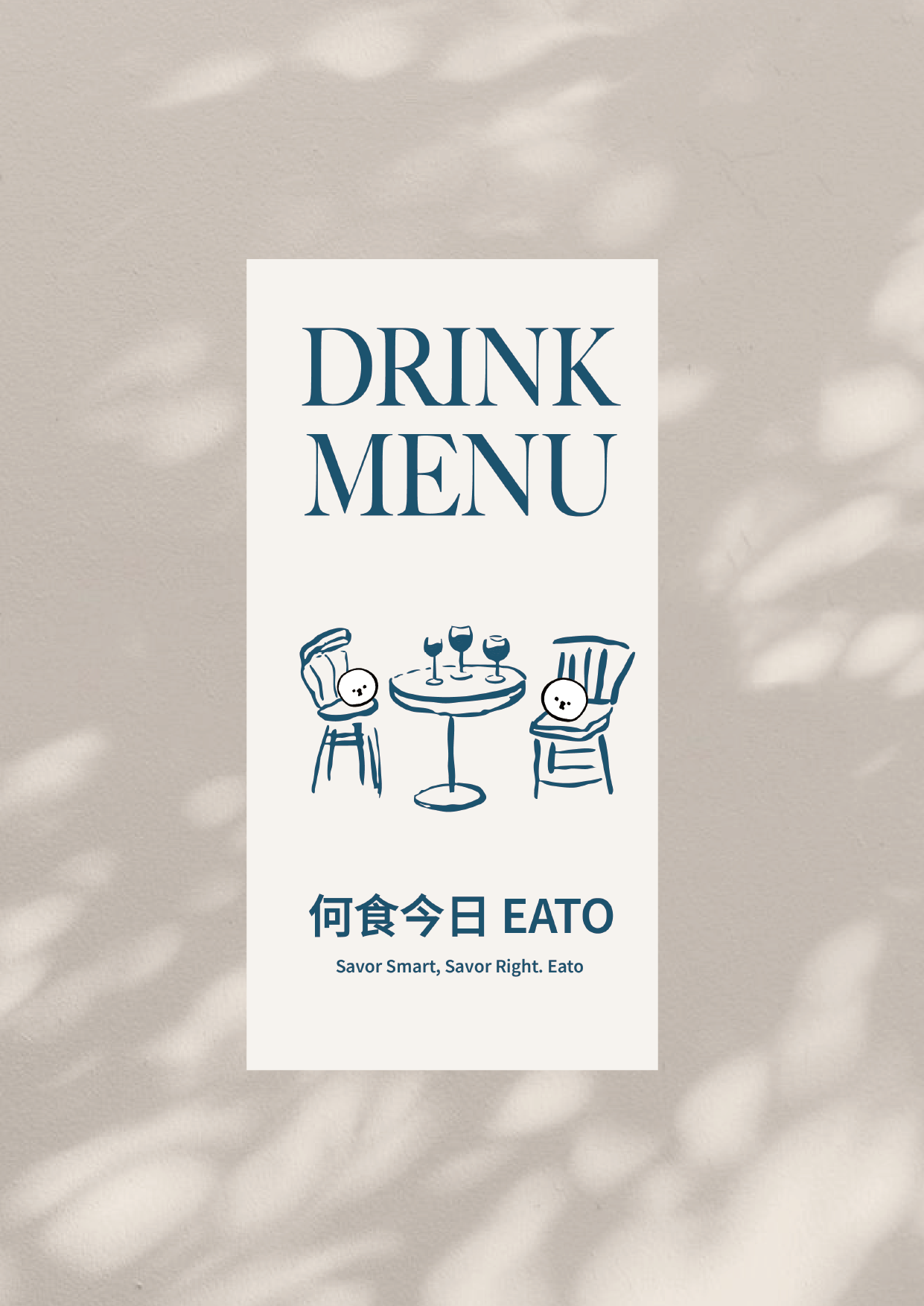
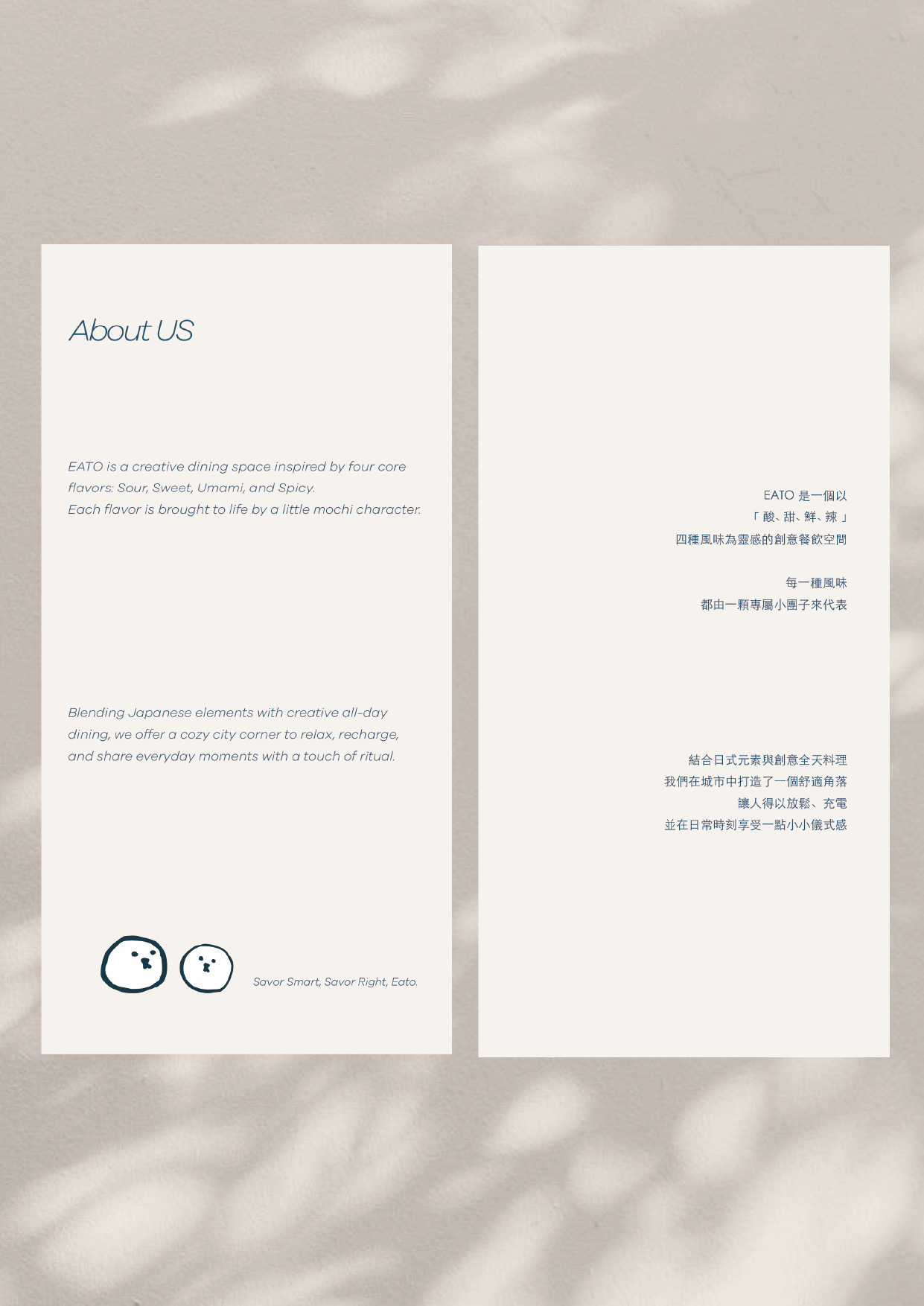
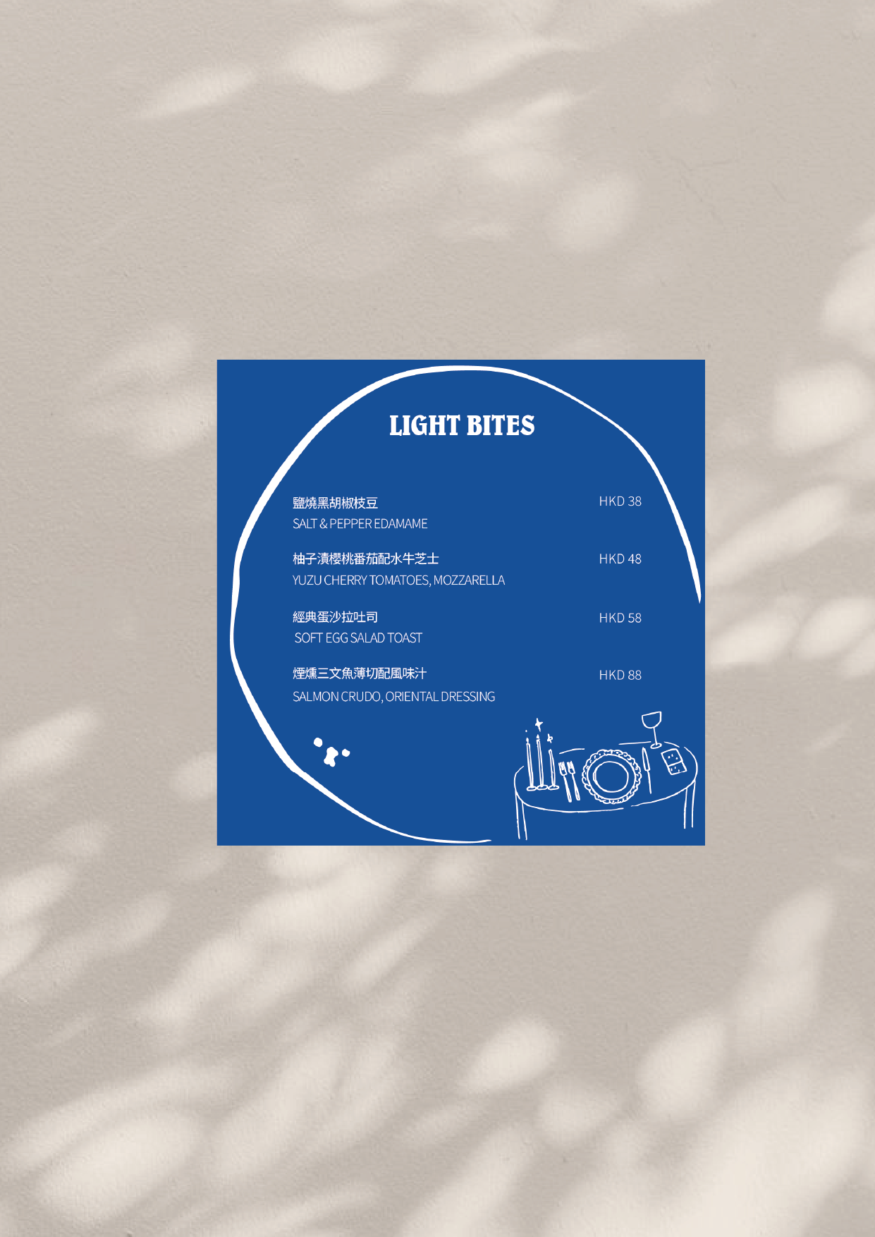


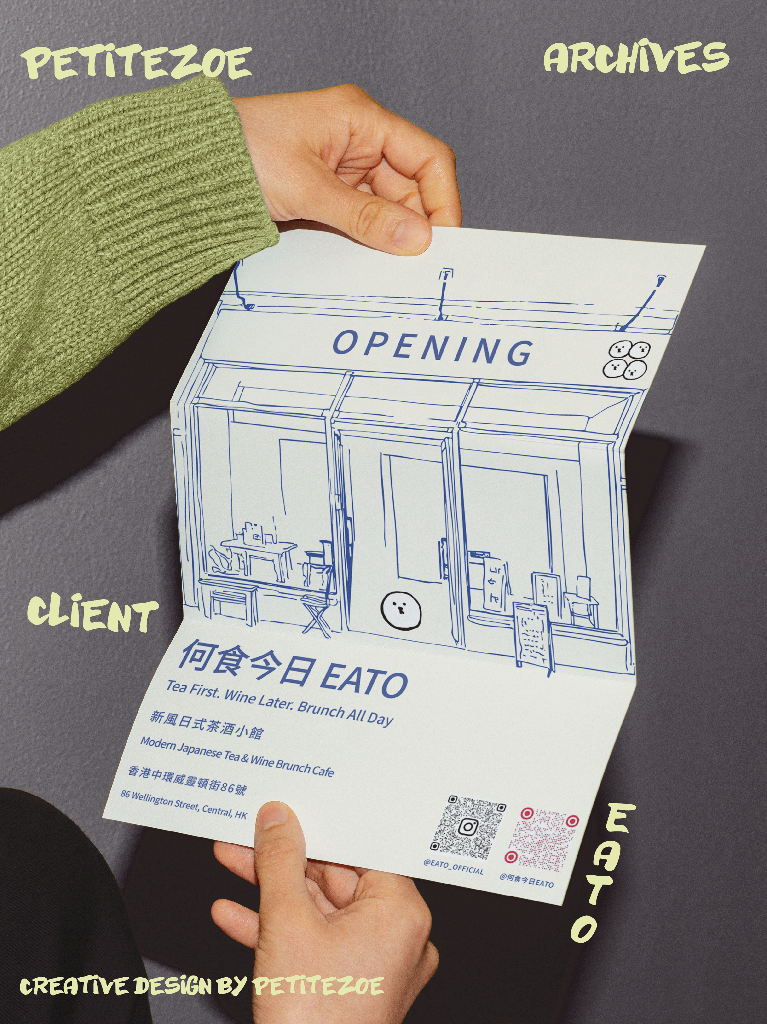
In contrast to the flat and standardised aesthetics common in the dining industry, I crafted a visual language grounded in hand-drawn outlines, organic irregularity and intentional imperfection.
This approach reflects a brand personality that is:
gentle, approachable, and quietly joyful.
The identity aims to communicate not just what EATO serves, but how it wants people to feel inside the space—slowed down, welcomed, and at ease.
As the brand moved into final VI development and store construction, I extended the system across:
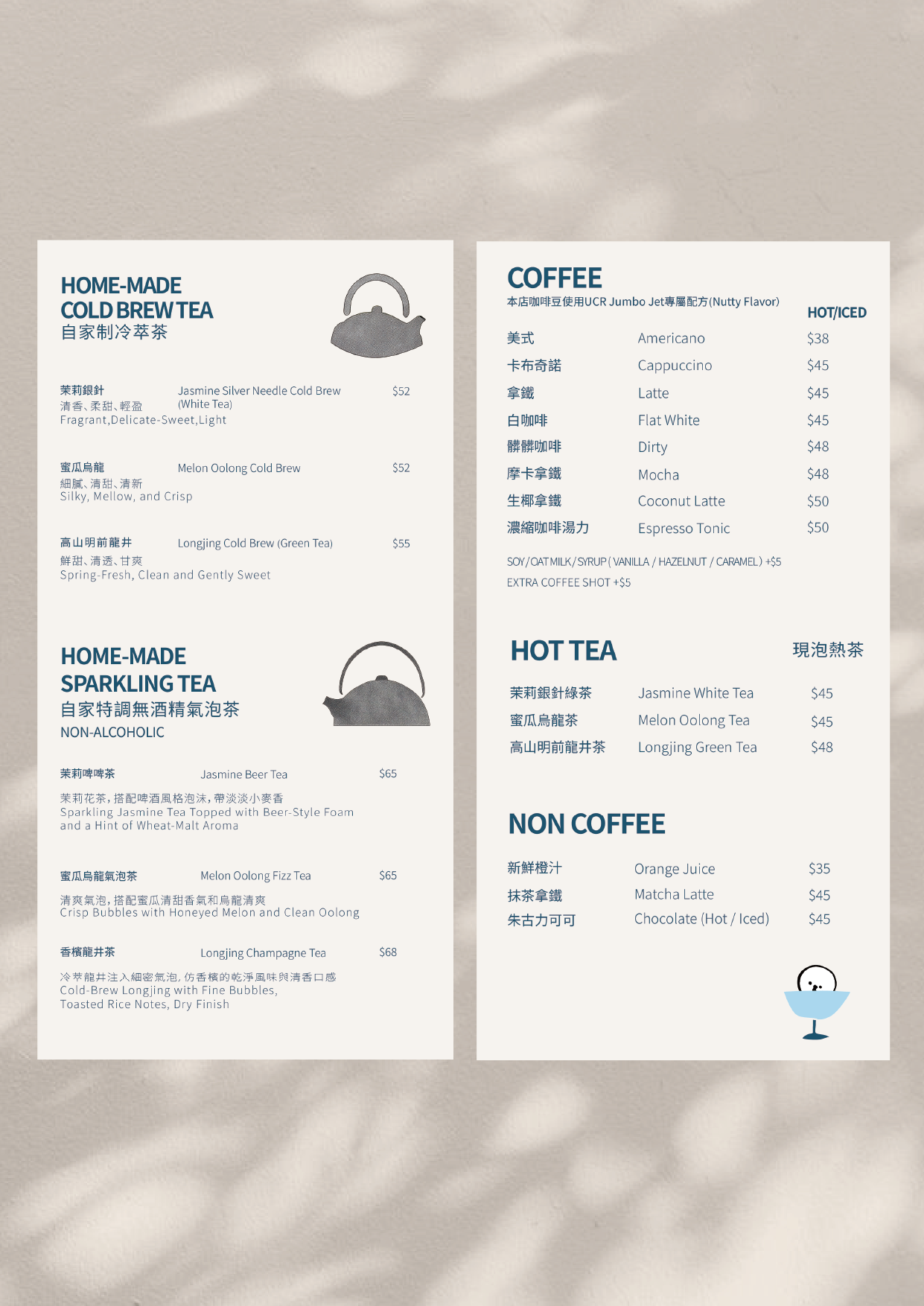
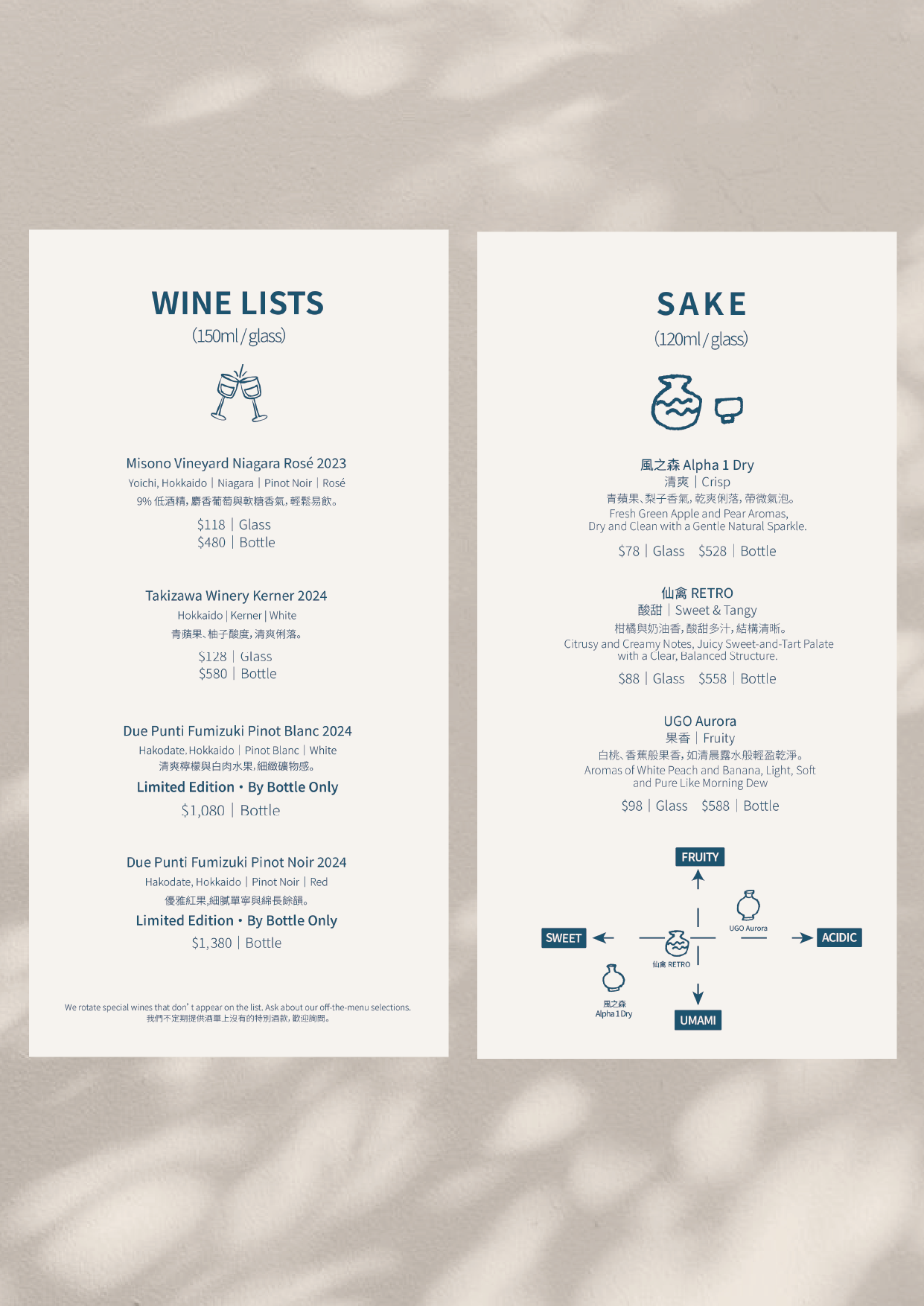
— Menu illustrations
— Packaging applications (bags, wraps, cup sleeves)
— Social media graphics
— Merchandise and in-store visuals
Each component is designed to evolve with EATO as it grows into future locations.
︎︎︎Previous page
© Copyright Zoe Sijia Guo
| g.sijiazoe@gmail.com |